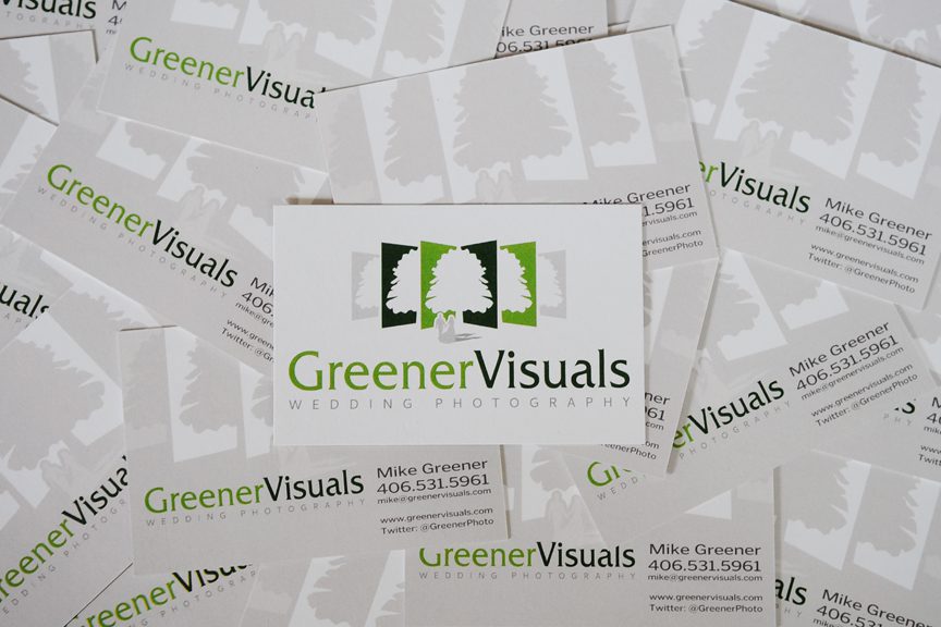
Greener Visuals Wedding Photography’s got a brand new bag…of business cards that is. In my ongoing effort to the spruce up the “storefront” of my wedding photography business, it was time to design a new business card to reflect my new look. I decided my design skills were up to the challenge. Obviously I wanted to emphasize my new business logo, maintain a professional looking card while providing all of my important contact information. I think I found a good balance. I opted not to put a photograph on the back side of the card this time around. It was good for a while on my previous cards but I noticed that my old cards started being picked through so that I was left with the images that everyone had looked over. The few left over, though good images, didn’t always work for selling my business services. If I only have one image to make that impression on someone I’d better hope it is going to be an image that that one particular person is into. The design amounted to being kind of a shot in the dark. Beauty is in the eye of the beholder and individual photography tastes are no different. So with that in mind I decided to forego the photo and put only my logo on the back. Like all things in business, it’s an experiment. I’m a wedding storyteller and I hope that my card will peak the right bride and groom’s curiosity. I’m continuing to have my cards printed through Moo.com on eco-friendly 100% recycled card stock. These cards are awesome. I’ve gotten nothing but complements from folks I hand them to. The cards have a slightly larger size (than a traditional business cards) and thicker card stock. Moo cards make a great impression and I aim to keep that tradition going with this new batch. Now all I need to do is distribute them. Shoot me an email with your address and I’d be happy to send you a couple. All the best. -M
https://greenervisuals.com/wp-content/uploads/2011/06/BizCard02.jpg576864GreenerVisualshttps://greenervisuals.com/wp-content/uploads/2019/02/Logo-Greener-Visuals-Photography-Horizontal_color_web-1.pngGreenerVisuals2011-06-05 07:11:022015-09-17 19:41:21Hot off the Press! – New Greener Visuals Wedding Photography business cards
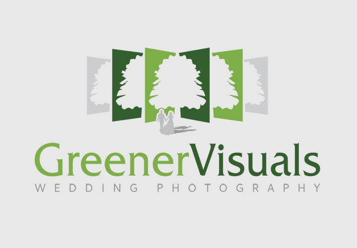
I am thrilled to share with all of you guys my brand new logo for Greener Visuals Wedding Photography. For the past year I have been debating redesigning my wedding logo. My original homemade logo with the film canister shown down below was one I had designed myself but I felt it wasn’t conveying the essence of my business.
From the beginning of the creation of my wedding photography business, I had focused my attention on the basics of building a successful business; high quality photography, good customer service, business cards and a functional website. What I wasn’t paying attention to was the subtle yet important facet of having a solid brand and identity. One valuable lesson I’ve learned during the past year is that I can’t always do everything myself. Certain areas of expertise are worth paying for. I’m confident in my photography skills but I needed the help of other professionals to make this change while I juggled a wedding business and my daily newspaper job. With this season’s boost of wedding bookings that I have been getting, I decided it was a good time to rebrand myself. But, I wasn’t exactly sure how to formulate the identity of my business. I opted to go with the online company Crowdspring.com. The site hosts a network of talented graphic designers from all over the world who compete for job bids on the Crowdspring site. You start off by naming your goals for your logo, what your business is about, etc.
I wanted my logo to have a fun look, but still maintain a sense of professionalism, show that I am a creative photographer and wedding storyteller, and complement my style of photography. After posting my ideas to the site, designs poured in. I found a mix of really talented designers as well as some less than ideal ones. As each design concept came in, I gave detailed feedback about its components, from color schemes to typography. Like in so many things, I ended up succeeding in my hunt for the perfect logo because there was good communication between me and the designers. Here are some of the logo concepts I considered:
For two weeks, I sorted through more than 250 different logo concepts from designers all over the world. We played with the fonts, color schemes and symbol concepts. The trick was trying to figure out what logo identified with my business. It wasn’t an easy thing to to do and there were numerous times I was panicing that I wouldn’t be able to find the right one. Then I found Marc Griesinger, a German marketing professional and graphic designer. Marc came to me with the book pages idea with the oak tree. I liked the symbolism of a couple starting their new family tree through marriage and the subtle concept of conveying the idea of me being a wedding storyteller through the page concept. I liked it but it still wasn’t saying weddings enough. Through the great communication between Marc and I, we came up with the idea to put the grey couple under the tree. I knew right then and there that I had found what I was looking for. Marc is incredibly creative and worked with me to fine-tune the perfect logo for my business. He understood that I was a creative just like he was. I really appreciated Marc’s punctuality. There wasn’t a time when I could not reach him and he was very responsive to my requests. Building a logo was a very personal journey for me and at times there were disagreements between me and the other creatives. Marc is very proud of the work he does, yet he was willing to entertain my creative concepts and in the end I think my logo was stronger than it originally could have been. I appreciated that a lot and I can’t thank him enough for all of his hard work. I think Marc also felt proud of the end result because my logo is now included into his logo portfolio on his website. I couldn’t be happier. -M
https://greenervisuals.com/wp-content/uploads/2011/04/NewGreenerVisualsLogo.jpeg500720GreenerVisualshttps://greenervisuals.com/wp-content/uploads/2019/02/Logo-Greener-Visuals-Photography-Horizontal_color_web-1.pngGreenerVisuals2011-04-18 00:15:242018-01-07 01:46:47Rebranding my Wedding Business – Greener Visuals Wedding Photography gets a New Look!


 For two weeks, I sorted through more than 250 different logo concepts from designers all over the world. We played with the fonts, color schemes and symbol concepts. The trick was trying to figure out what logo identified with my business. It wasn’t an easy thing to to do and there were numerous times I was panicing that I wouldn’t be able to find the right one. Then I found


I welcome and support everyone
Facebook
Instagram
Twitter
Pinterest